Overview
As the Associate Director of User Experience, I oversaw and managed the visual design and interactive experiences of cognizant.com.
For 8+ years I was intimately involved in many types of projects beyond the traditional conception and design of global marketing campaigns. This included establishing new development practices, migrating coding frameworks, building prototypes, and contributing to project management templates and standards.
I worked collaboratively with a wide range of people from across multiple disciplines: writers, designers, project managers, developers, engineers, clients and stakeholders, 3rd party vendors, external agencies and more.
Prototypes
Working with the development and engineering team, I guided them through major framework shifts.
I facilitated weekly (sometimes bi-weekly) working sessions to review coding techniques, projects requests, bug reports and discuss UI/UX issues.
As things progressed, I would prototype various marketing pages using our new approach to show them how it can be implemented. Handoff would entail further refinement then transfer to the AEM (Adobe Experience Manager) engineers for integration into the CMS.
This close working relationship between creative and technology proved highly successful. It enabled the team to quickly rebrand 90% of the 6,000+ pages of the site during a refresh. They are now able to expand the component design while maintaining consistency and quality.
I’m proud to have led the shift to a more robust and modern creative development process.
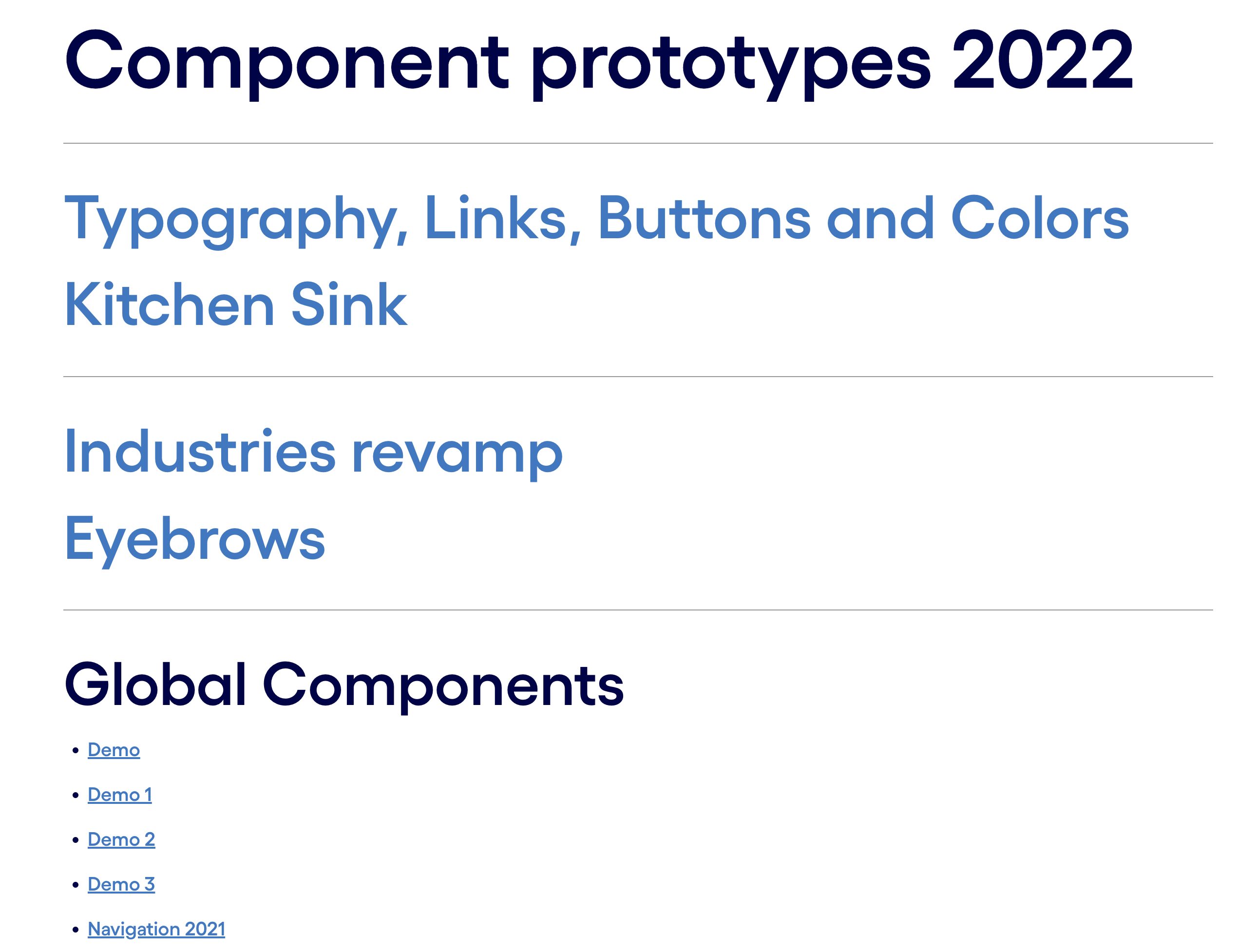
Component playground

AI campaign landing
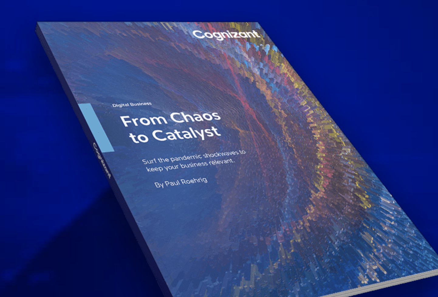
Chaos to Catalyst report

Chaos to Catalyst landing

The Face of CX

Digital Maturity Index

The Work Ahead
Figma design library
In order to maintain consistency across all the digital channels, I created and maintained Cognizant’s Figma design library.
To match the live, production-ready components created with the development team, I reverse engineered everything into Figma. This would ensure that anything that was created would be as close to the final product as possible.
This approach gave confidence that what was presented would be visually accurate and able to be produced, resulting in 2-3x faster turn-around from presentation to launch.
Component documentation
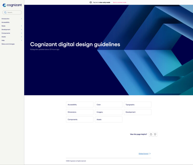
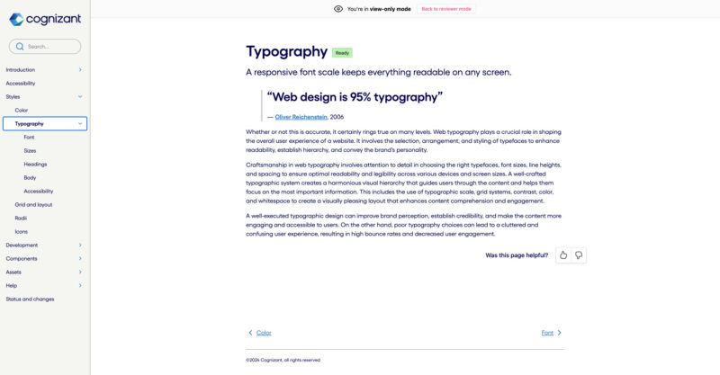
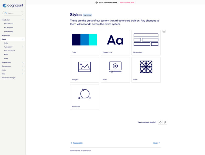
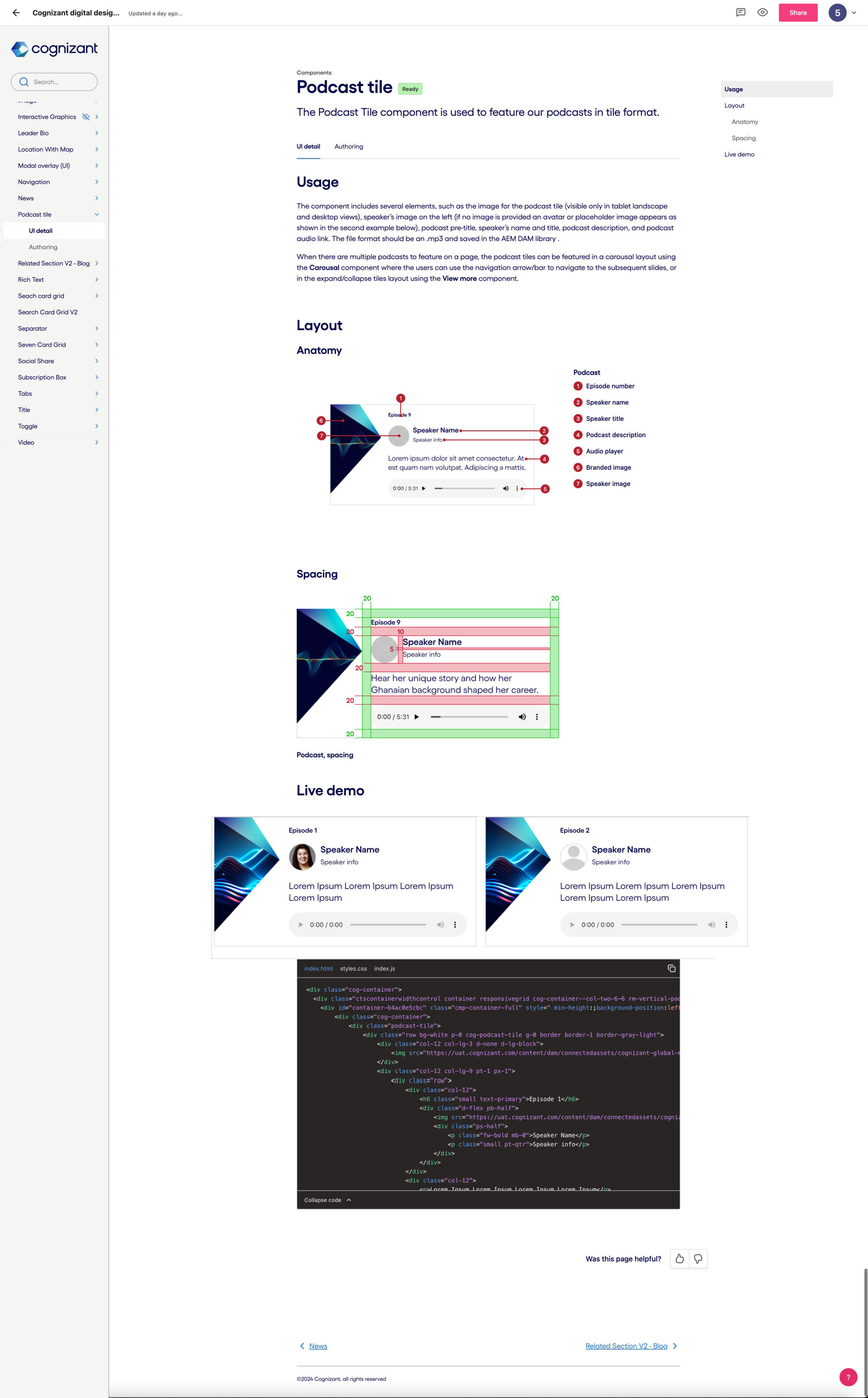
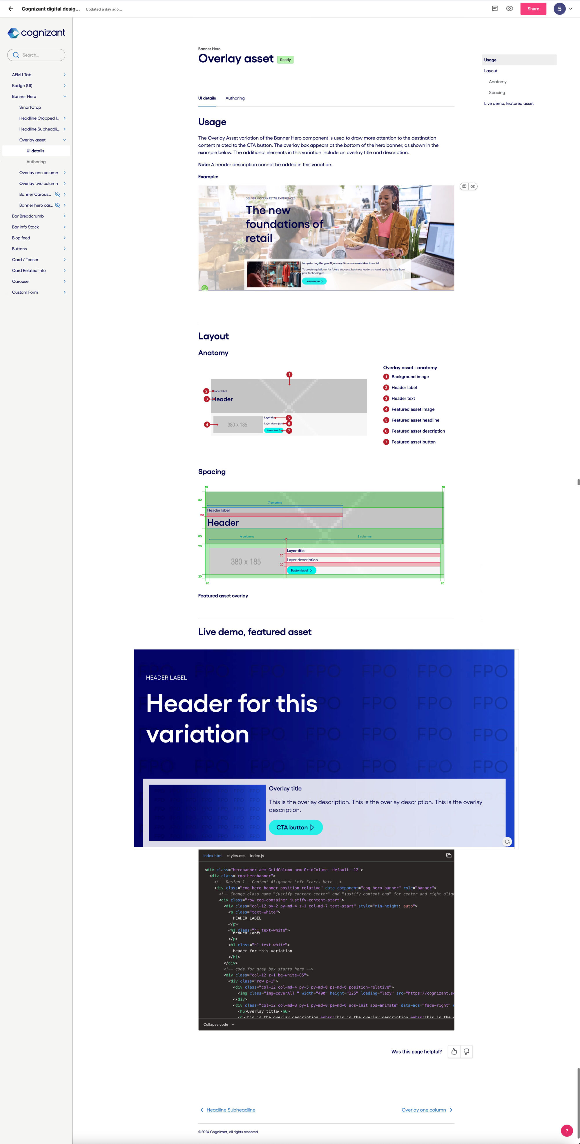
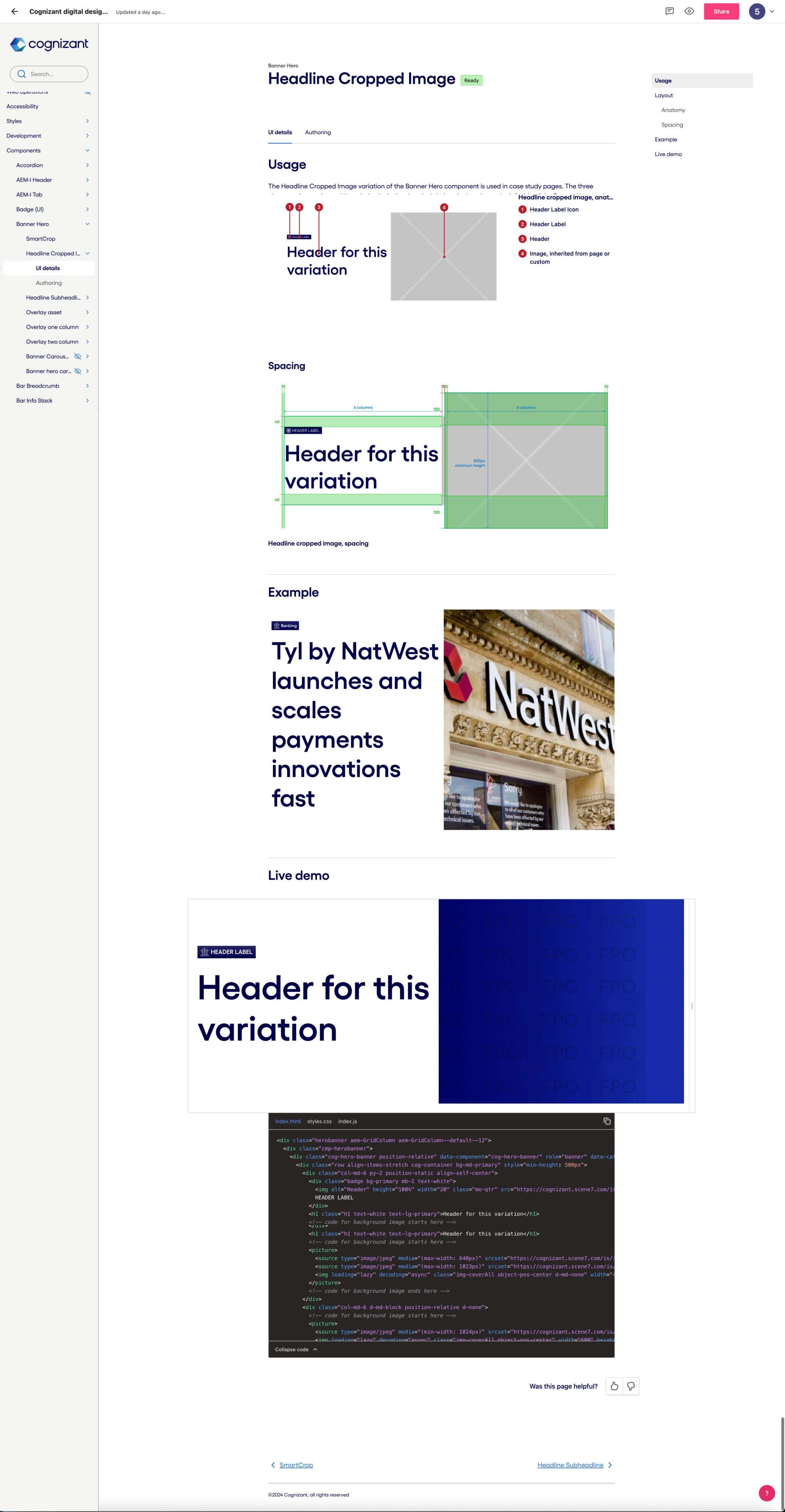
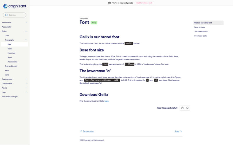
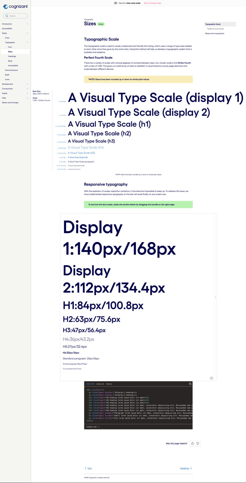
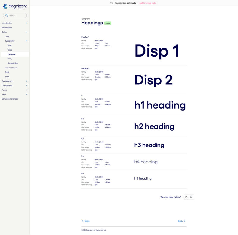
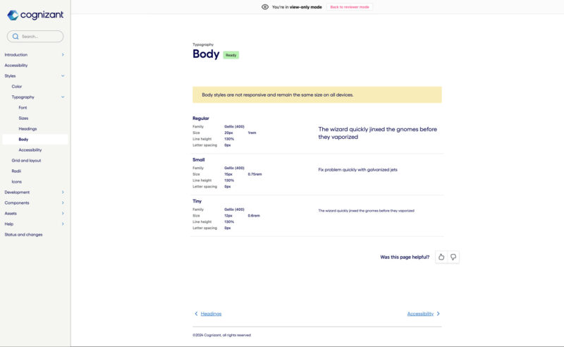
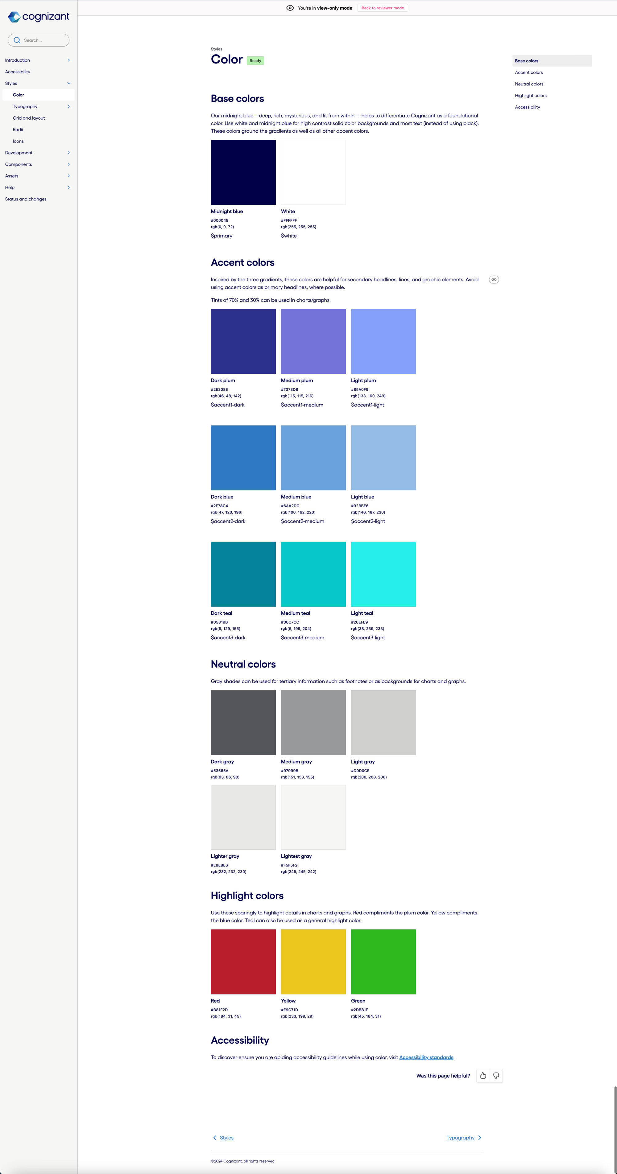
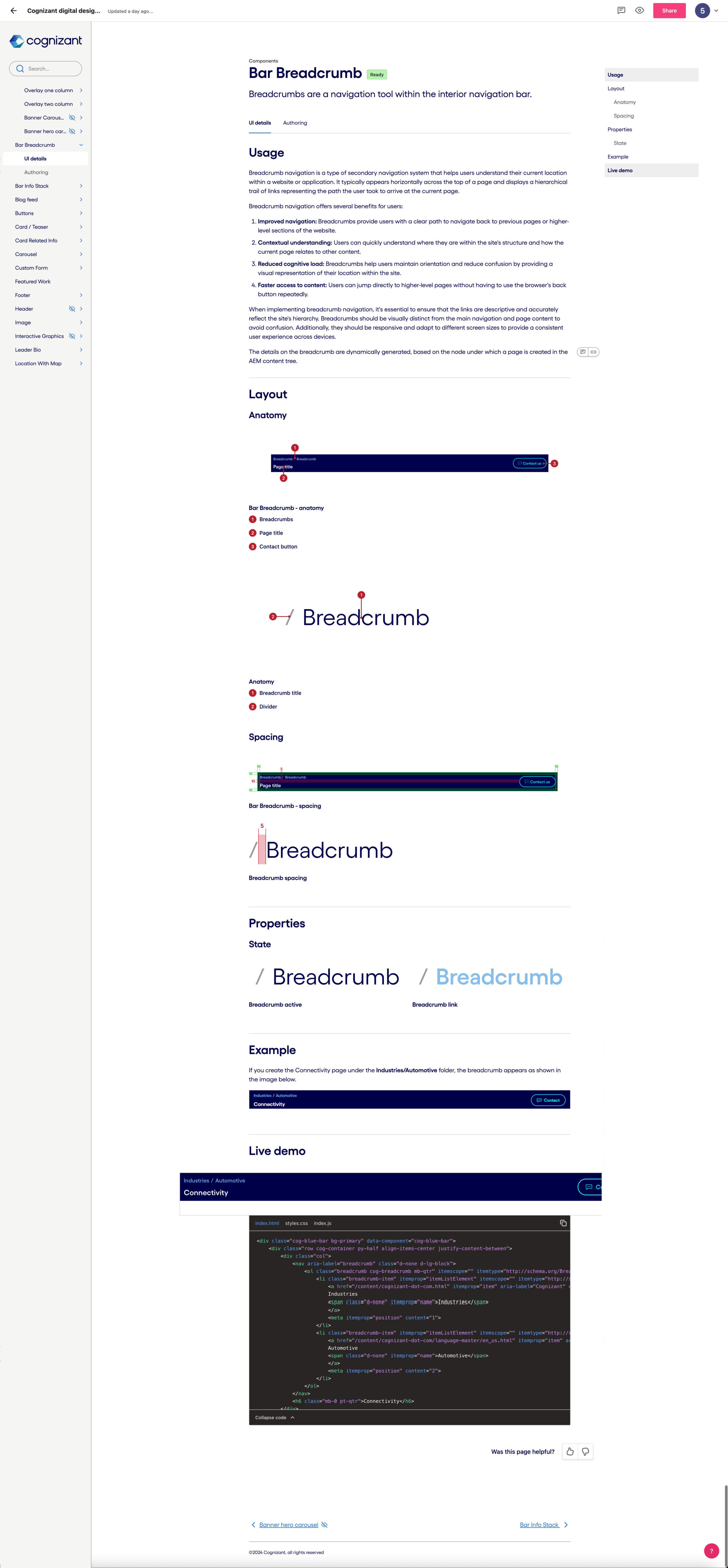
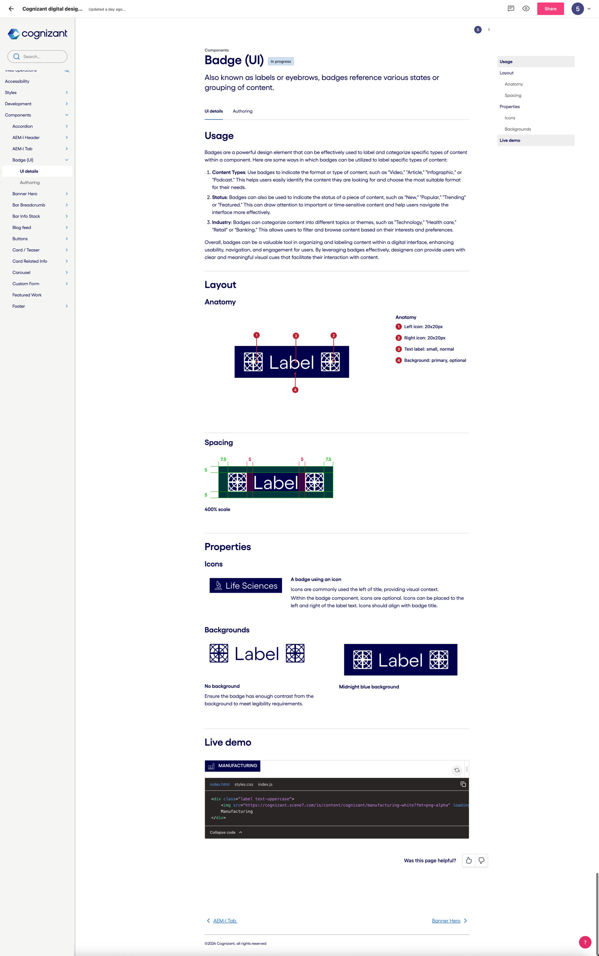
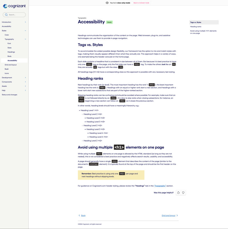
For years, documentation was badly needed. I was finally able to fill that void with a guide created with the online platform Zeroheight.
Questions were constantly asked about what components were available, what were their options, and if certain layouts or interactions were possible.
With Zeroheight, I was able to document everything from the core styles to live demos of components. Zeroheight’s simple interface and powerful capabilities made documenting all parts of the design library quick and efficient.
A selection of screens…




Selected projects
(Click/tap to zoom then scroll and see details)
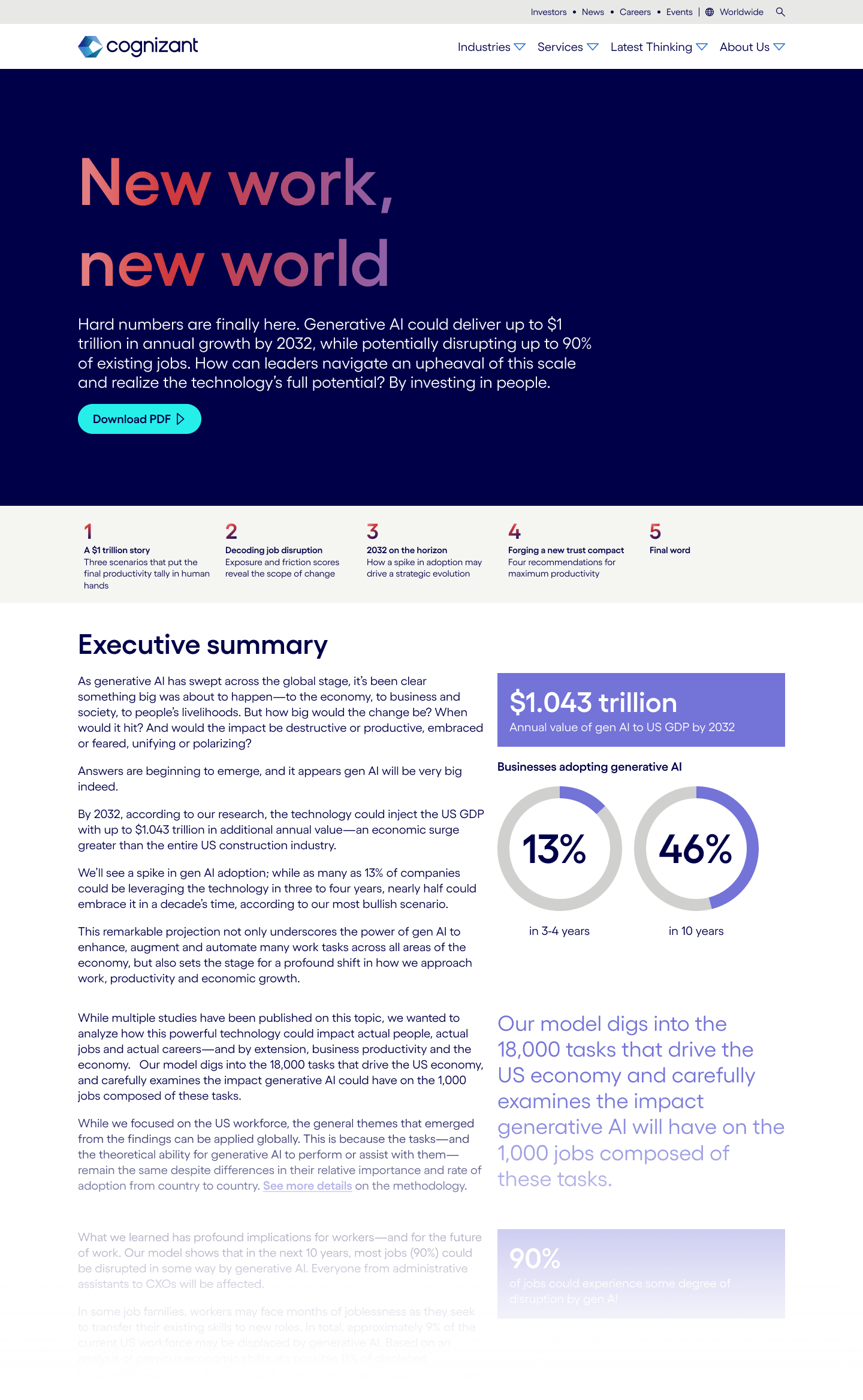
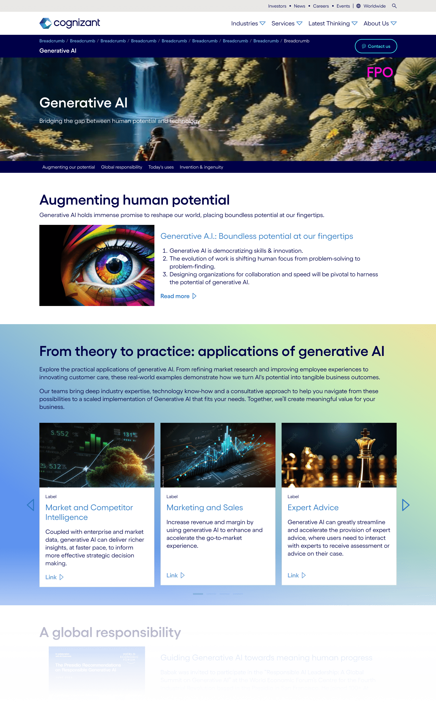
Generative AI report landing page

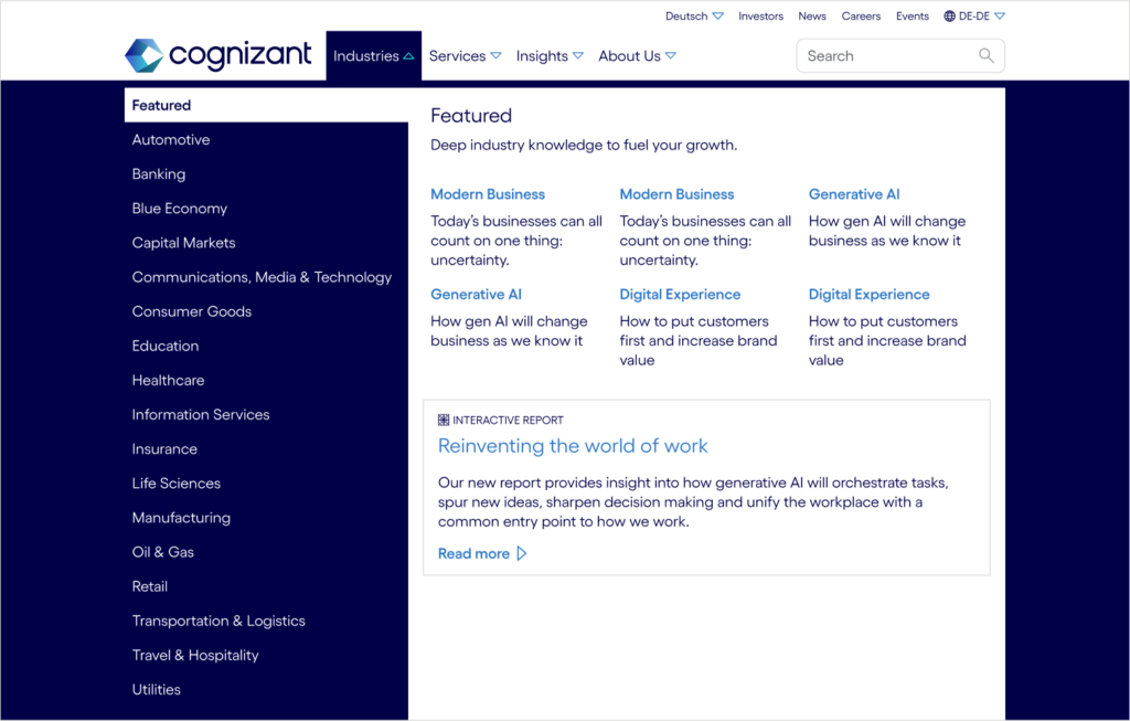
Global mega-menu redesign

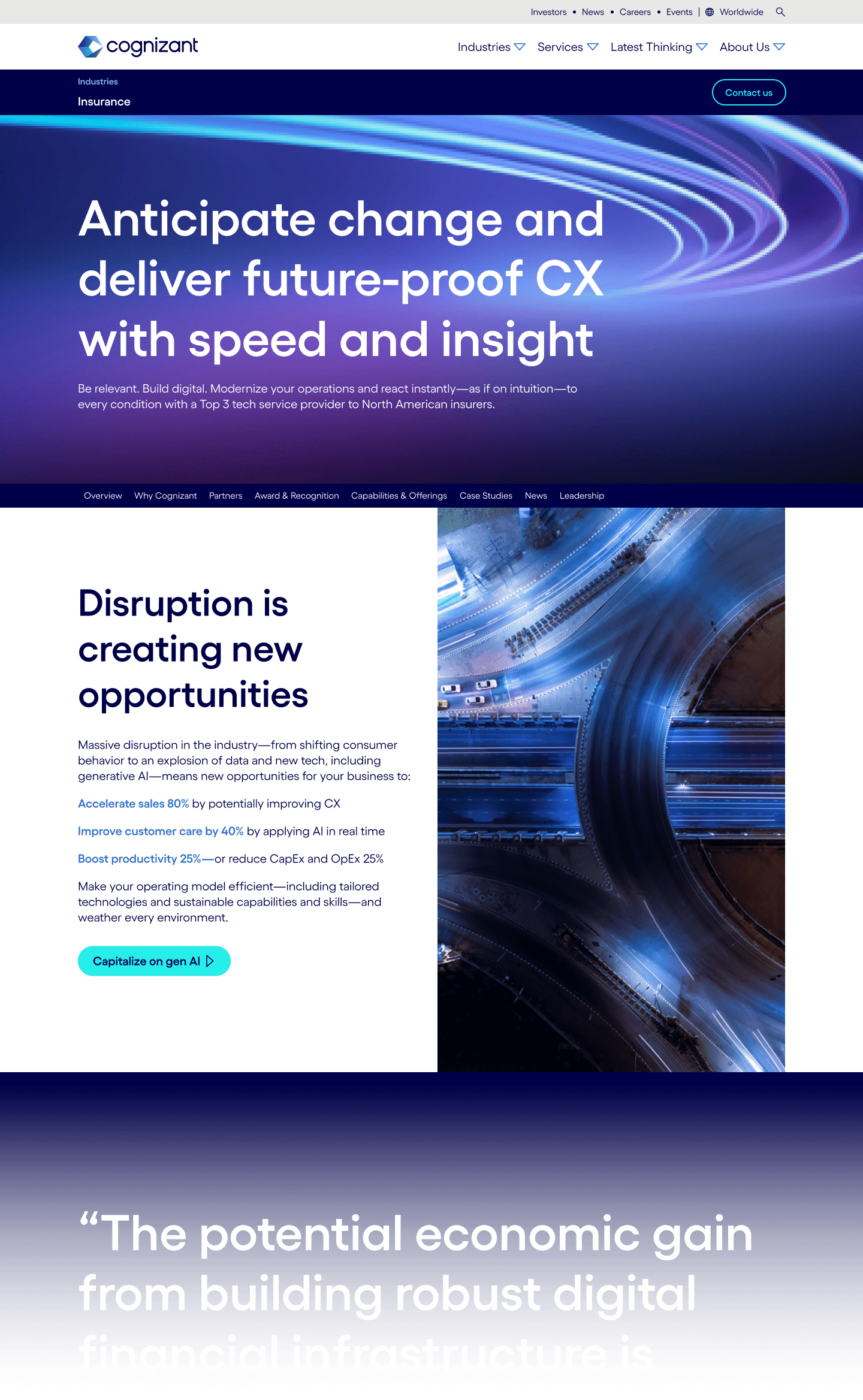
Industry-specific landing page redesign A/B test concept

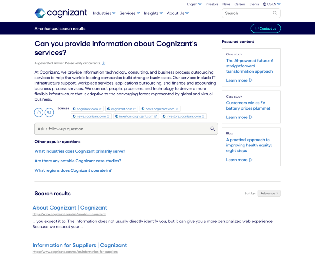
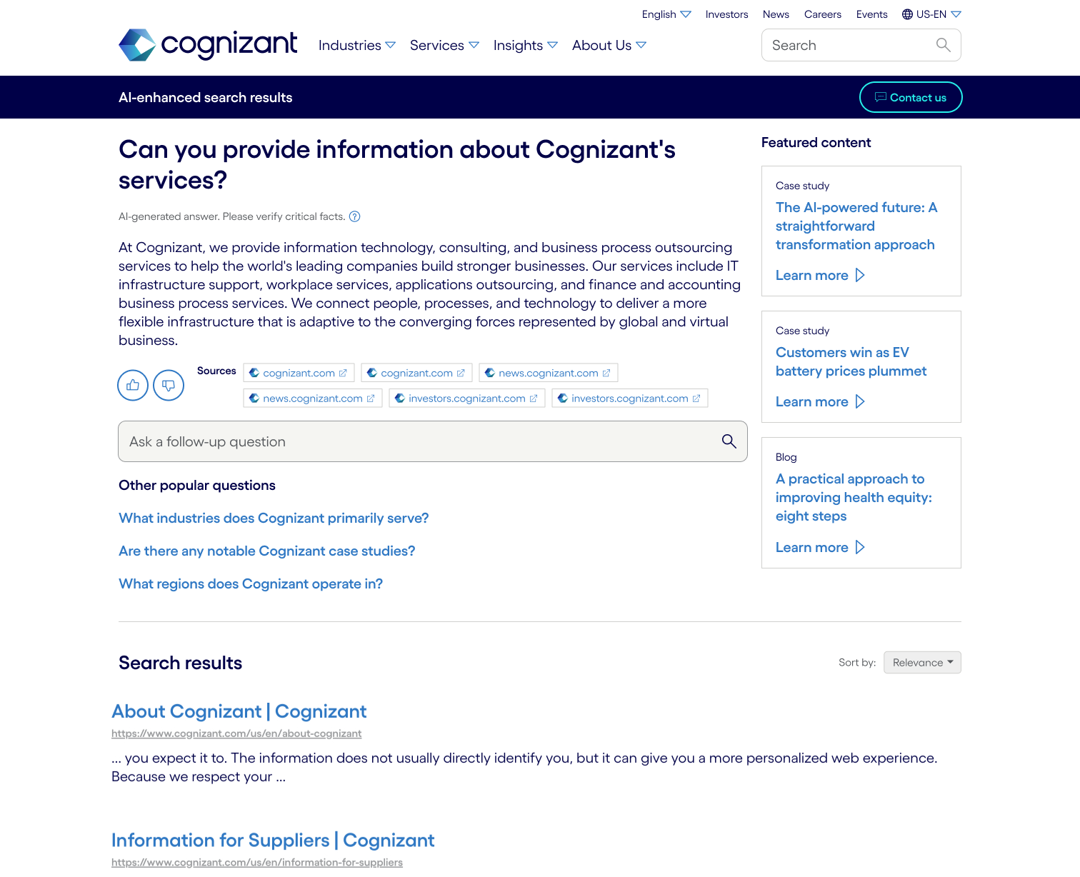
AI-enhanced search
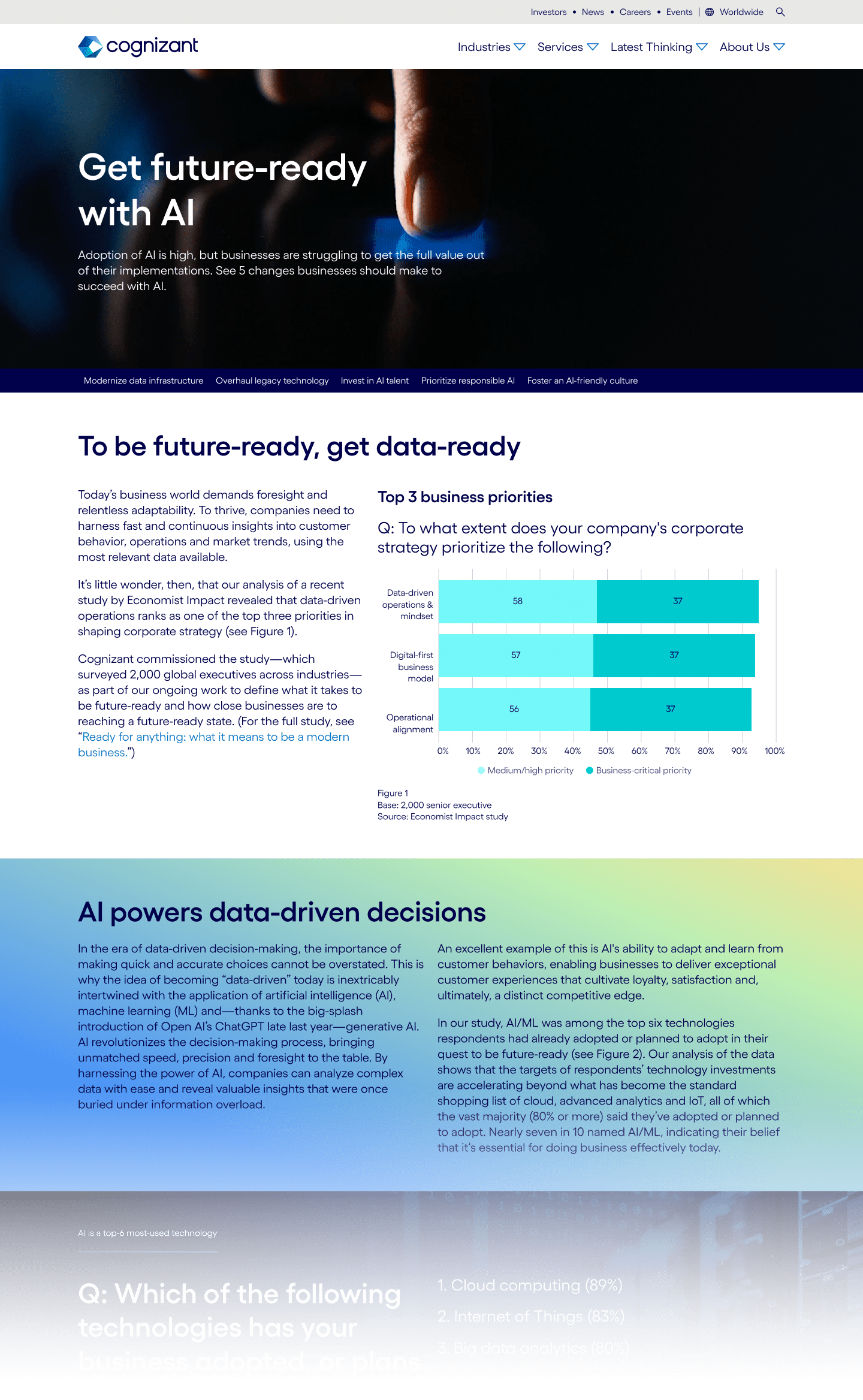
Five ways to become to AI-ready report

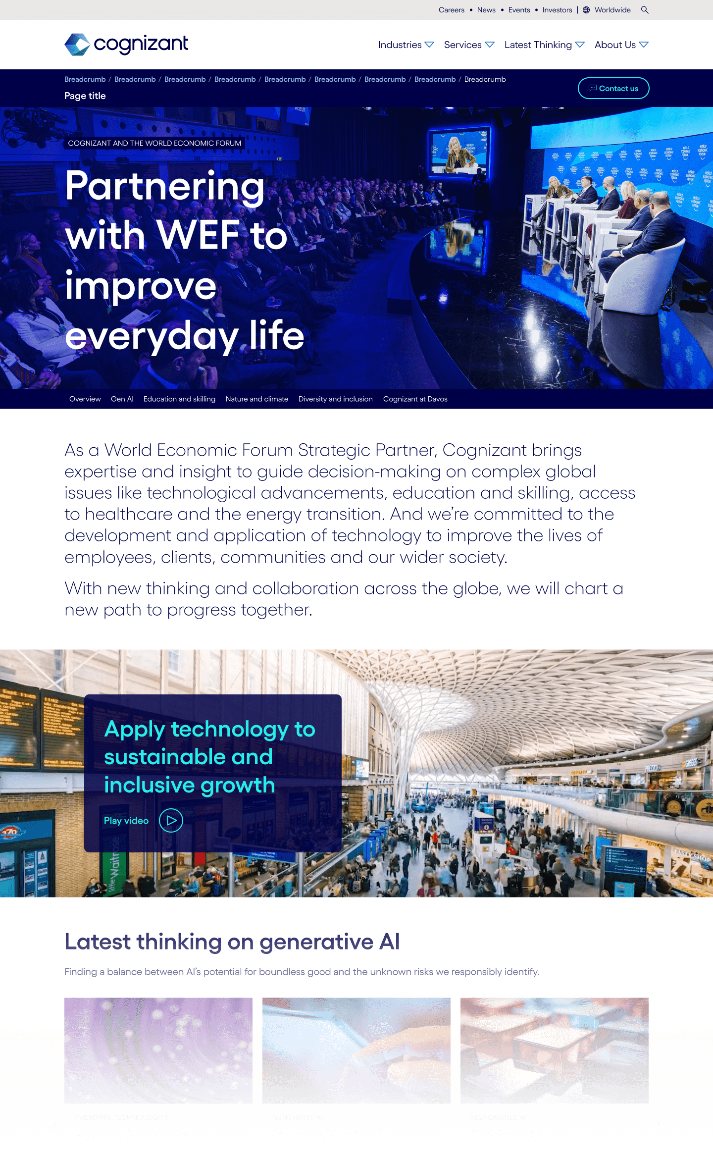
World Economic Forum landing page

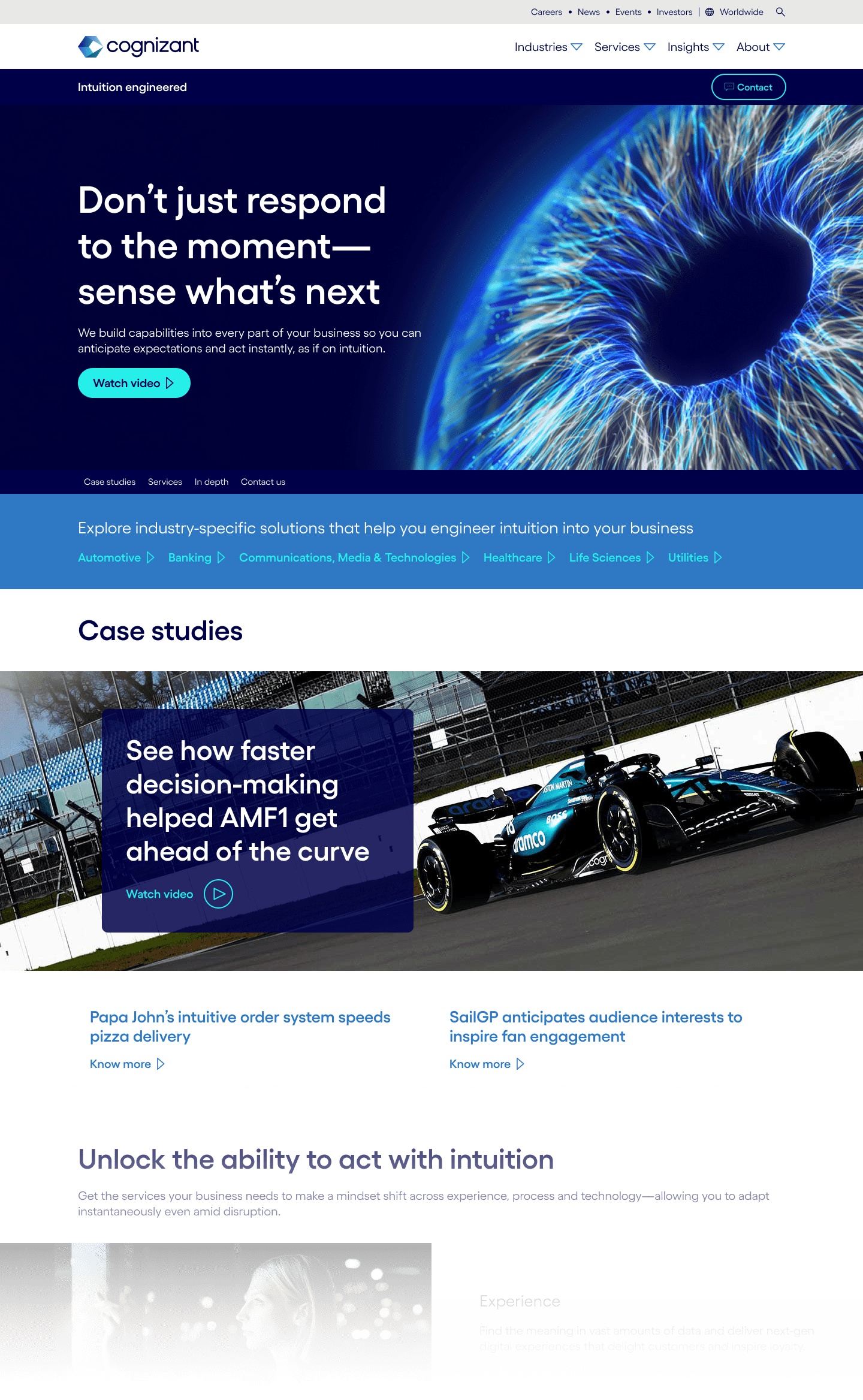
Intuition engineered promotional page

Tech to Watch report

More available upon request…
