Museum exhibit — Overview
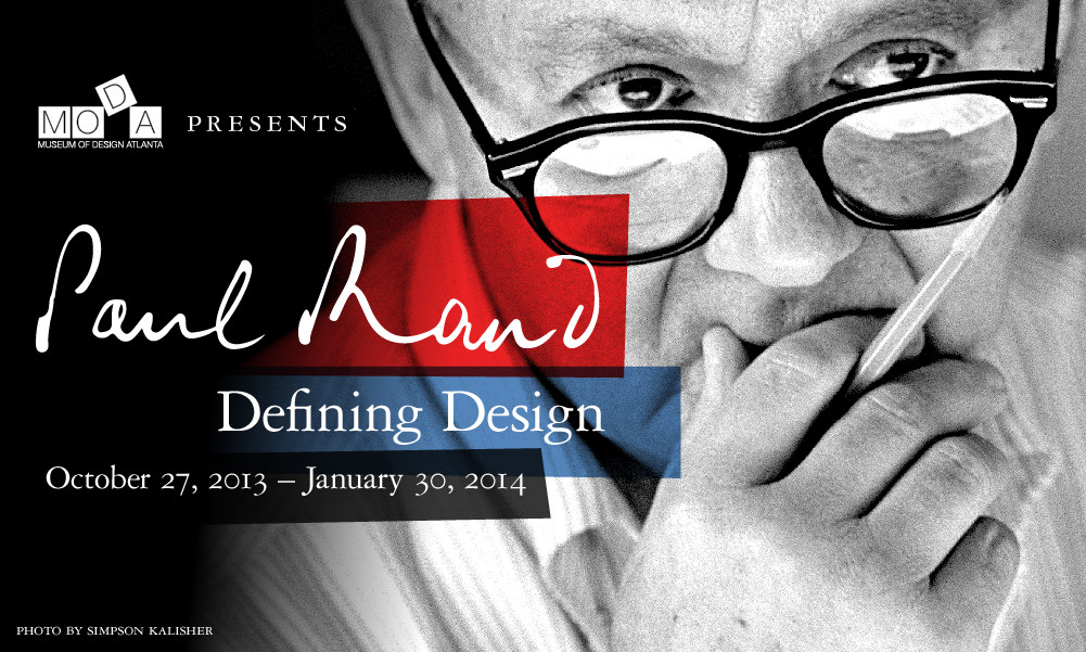
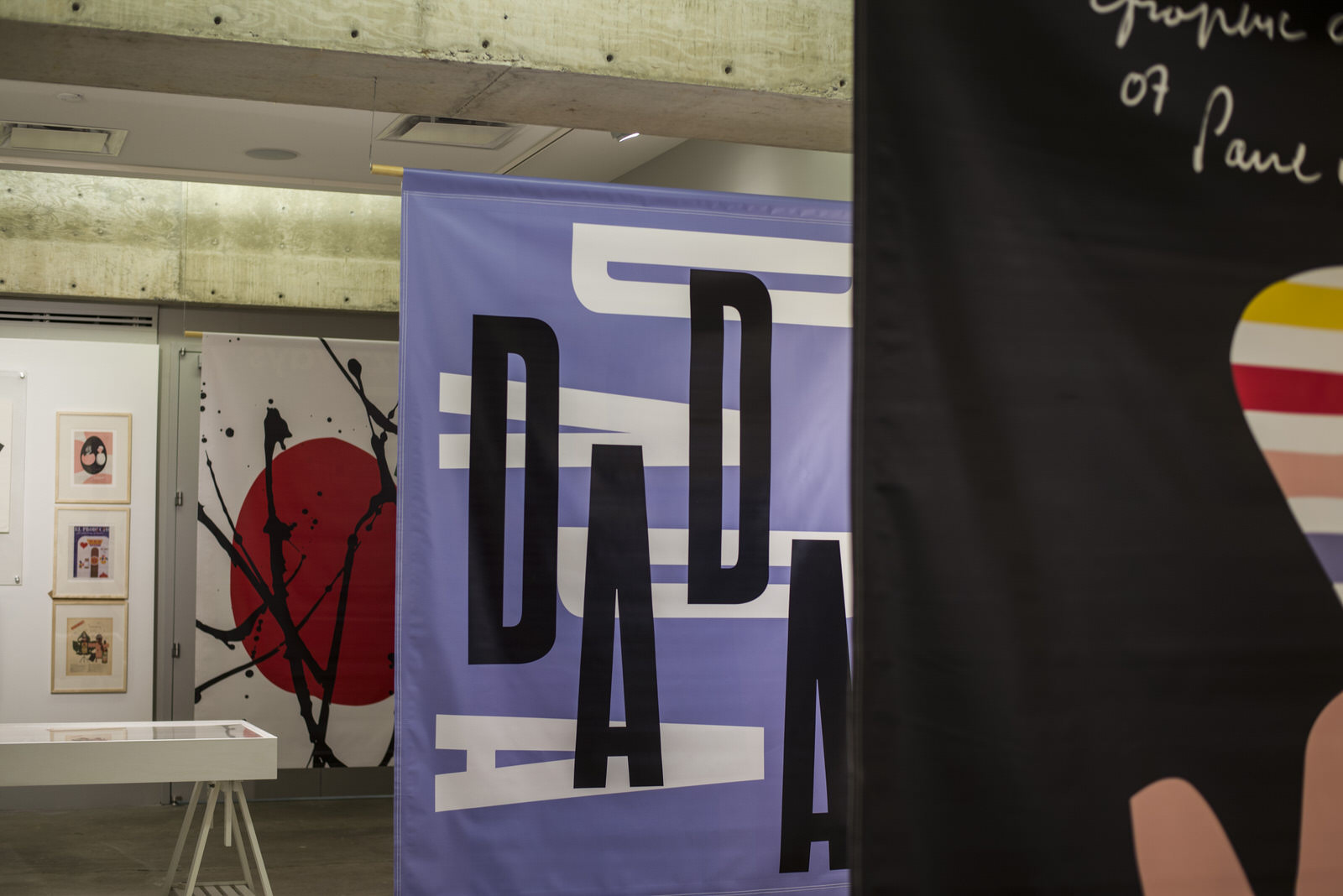
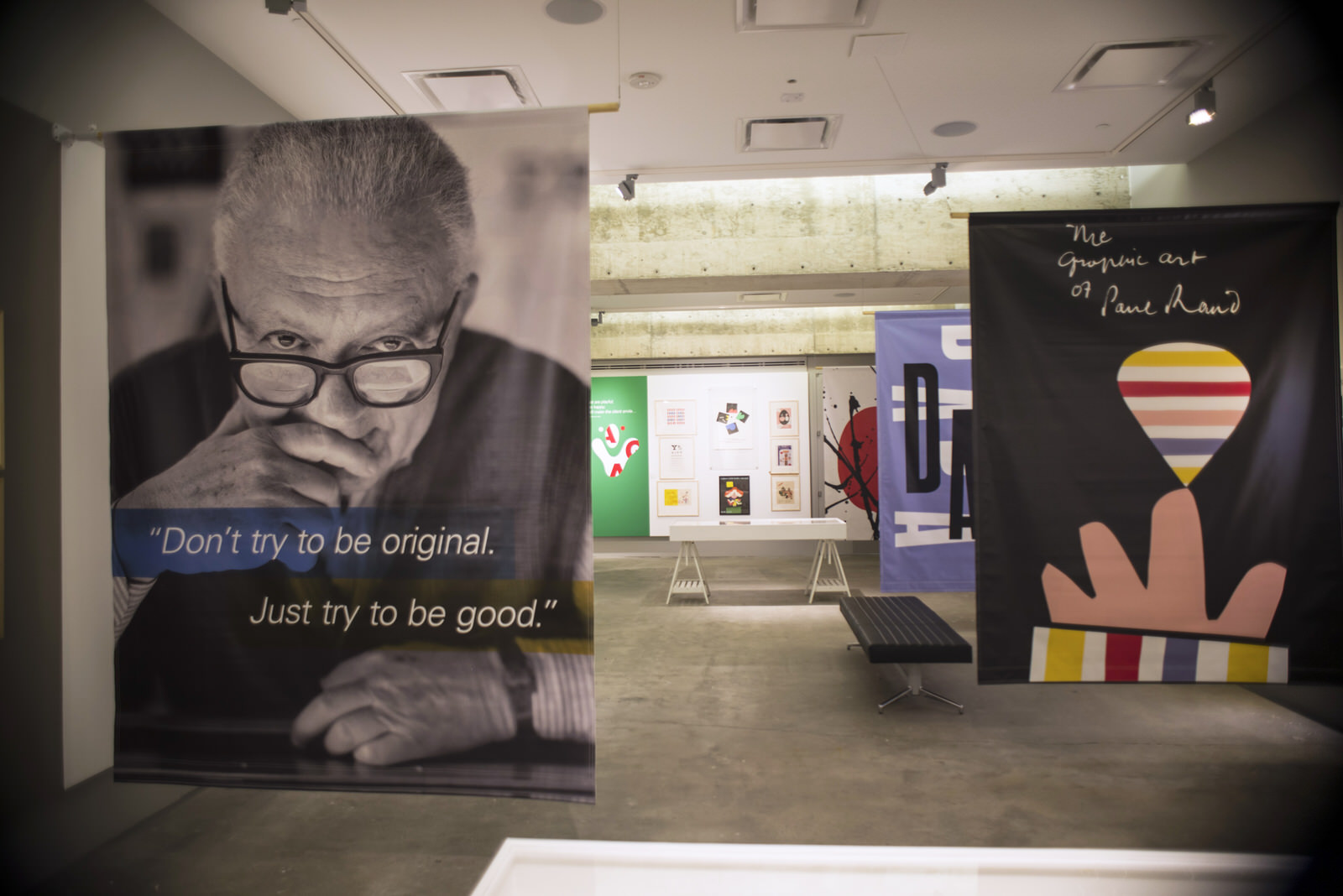
This exhibit examined Rand’s work in a unique way: through the lens of his writing on the subjects of art, design and aesthetics.
Based on his 4 ground-breaking books—where he redefines and simplifies these complex subjects—sections are grouped together based on topics such as symbols in art, typographic expression, stripes, the art of humor, repetition and others. Biographical information and personal items are also featured, along with video interviews.
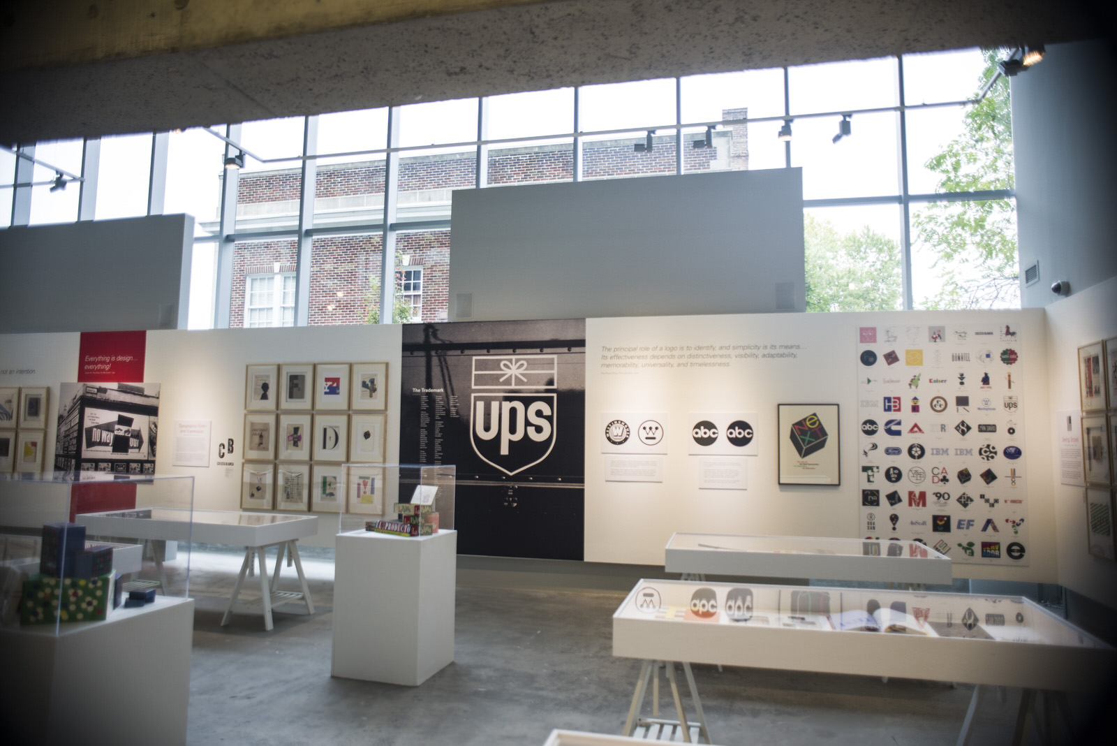
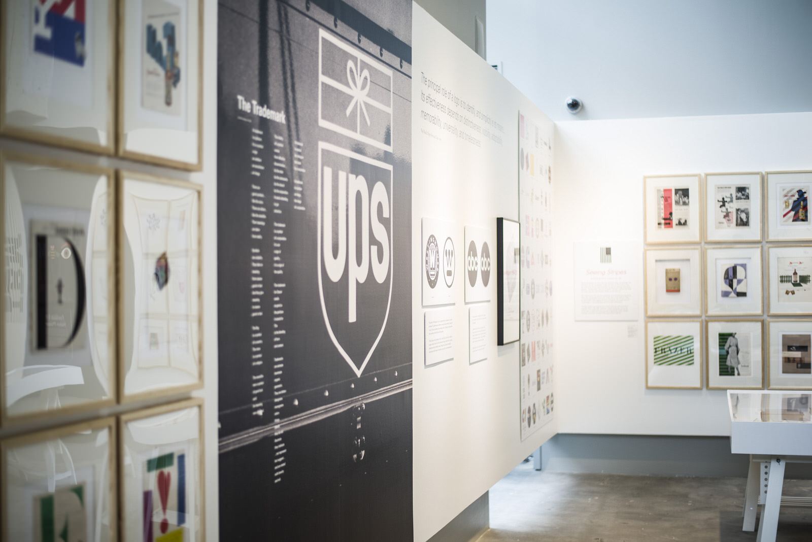
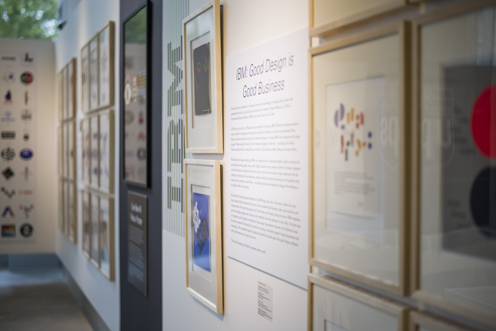
Rand defined design as a unified activity, based on analysis and governed by imagination. Or simply: “An idea that has found it’s perfect form.” Throughout his lengthy career – in which he created some of world’s most successful and recognizable logos such as those for IBM, Westinghouse, UPS, and ABC – his design work was governed by the fundamental principles he identified in his writings, such as beauty, intelligence, repetition, symbol, and humor.
Today, designers across the world derive influence and inspiration from Rand’s body of work, acknowledging that he set new standards for graphic design.

Exterior signage
Lobby
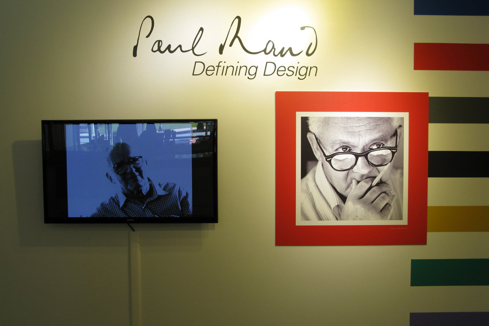
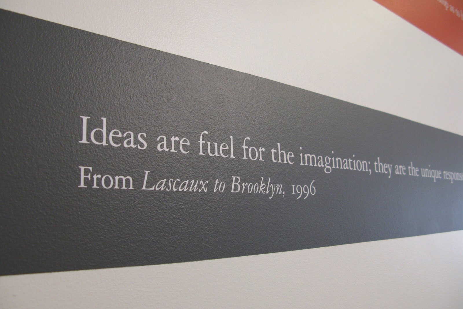
The lobby consists of the striped wall of “Randisms”: popular quotes in Rand’s famous gruff Brooklyn attitude as well as his more thoughtful and critical side.
The exquisitely animated 4-minute film by Imaginary Forces (created for his induction into the One Club Hall of Fame) welcomes visitors to the exhibit.
Hallway
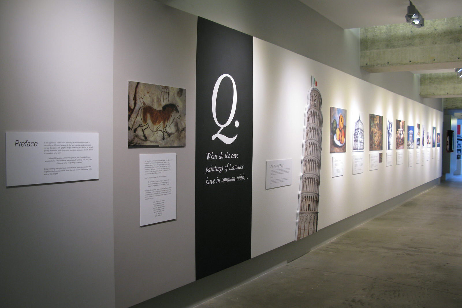
Hallway: Introduction and Timeline
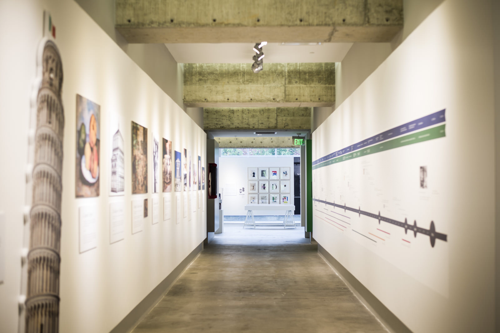
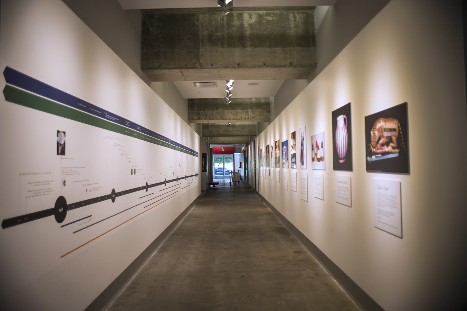
The hallway is composed of 2 unique elements:
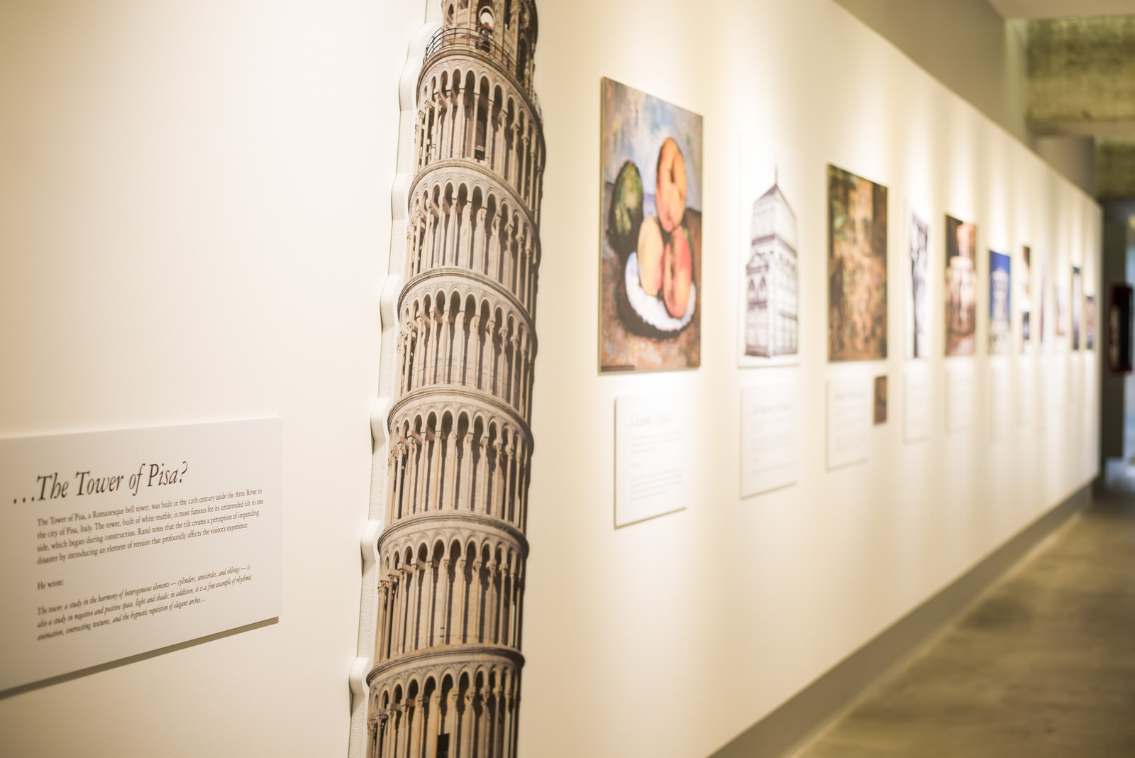
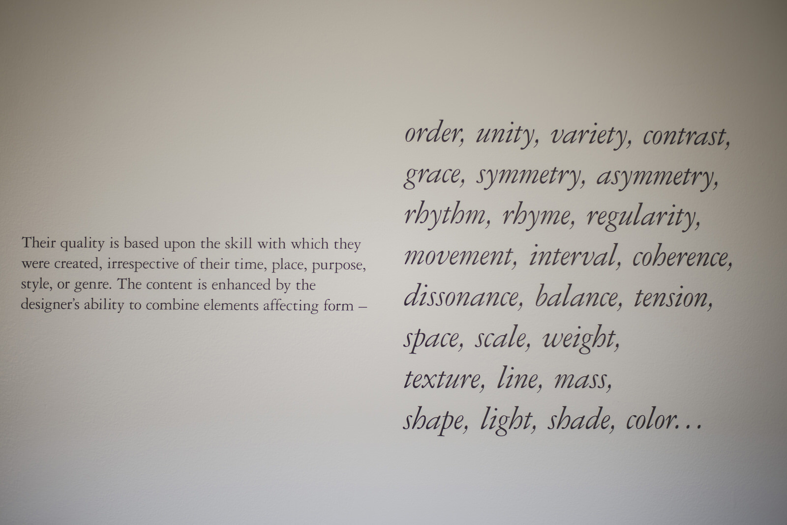
The left side is an introduction to Rand and a recreation of his introduction from his last book From Lascaux to Brooklyn, in which he questions what makes certain objects worthy of the title “art” and what aesthetic principles they share. Examples include the tower of Pisa, Cézanne’s apples, the Baptistery of Florence, Brueghel’s Children’s Games, a Romanesque capital, the fountains of the Alhambra, the Parthenon, Katsura Palace, African sculpture, fisherman’s buoys, an ancient pitcher, and Tipu’s wooden tiger sculpture.
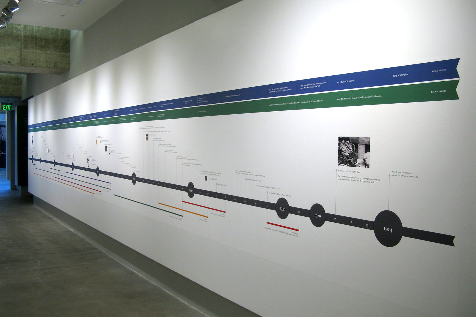
The right side is an extensive timeline of not only his life and work but also secondary timelines above in the blue and green bands that contain cross-references to what was happening at the time in world events and design culture, helping put his work into context.
Gallery A
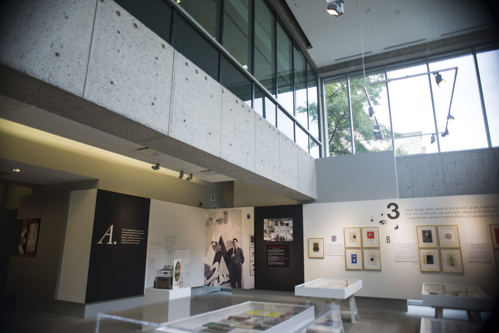
The main gallery answered the question first posed in the hallway: What do the cave paintings of Lascaux have in common with…?
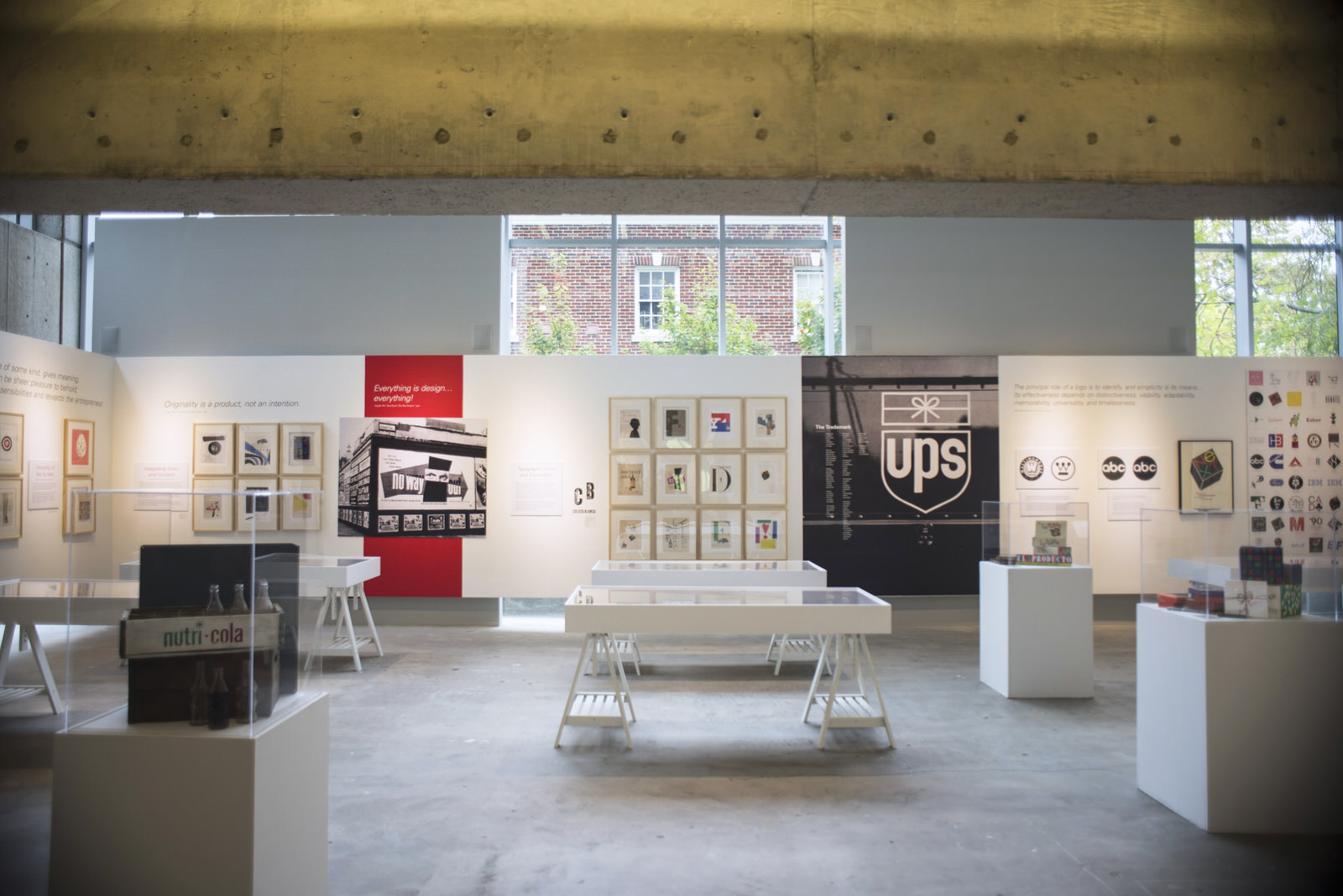
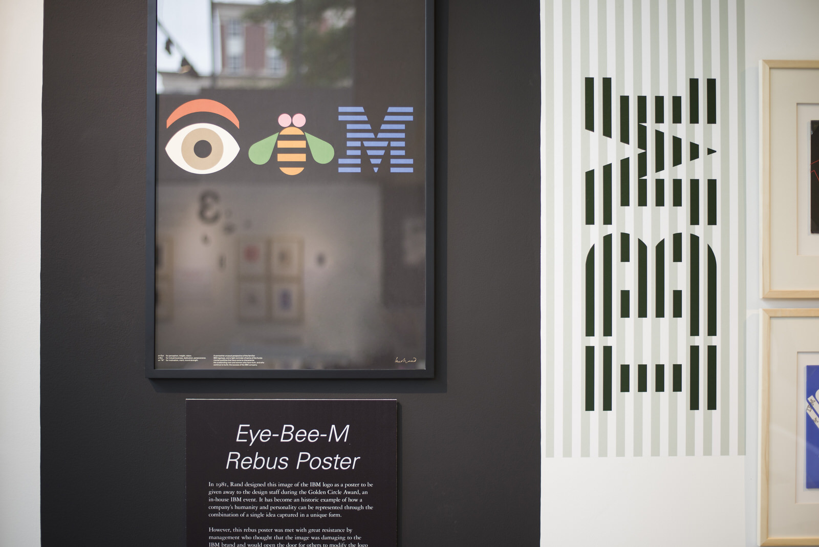
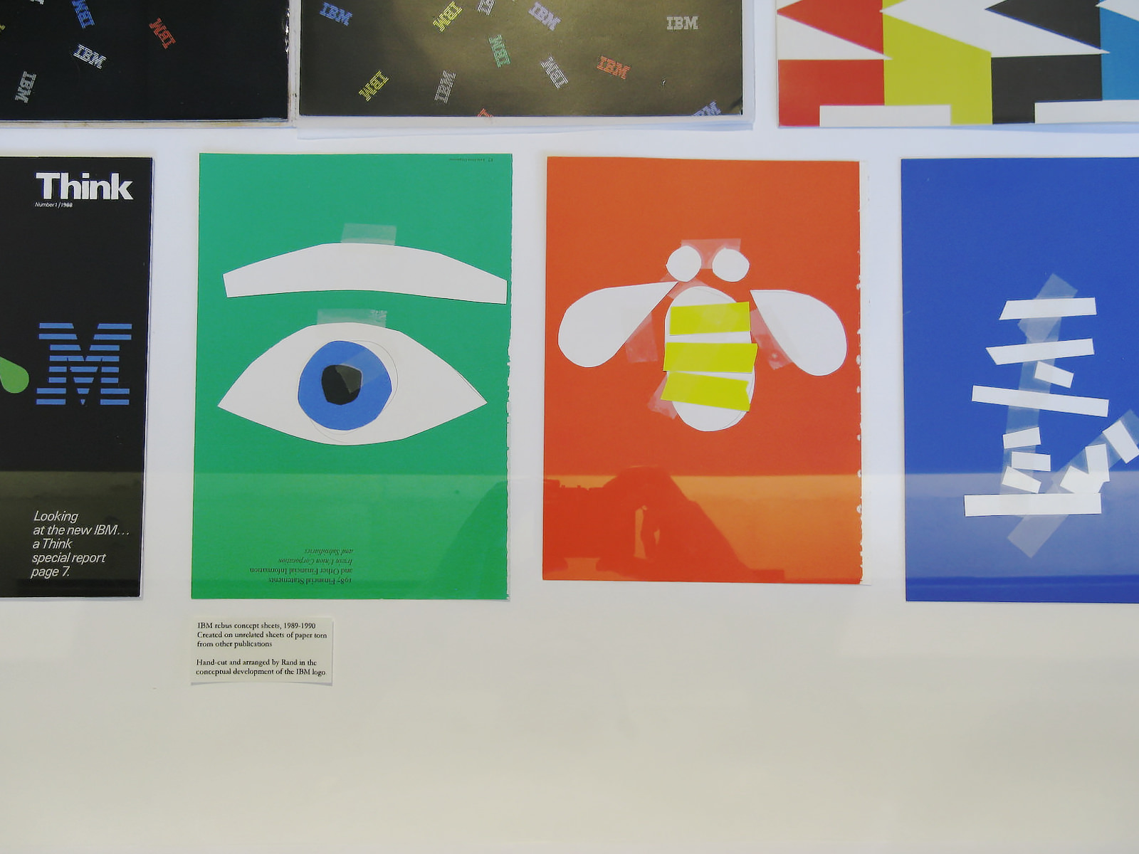
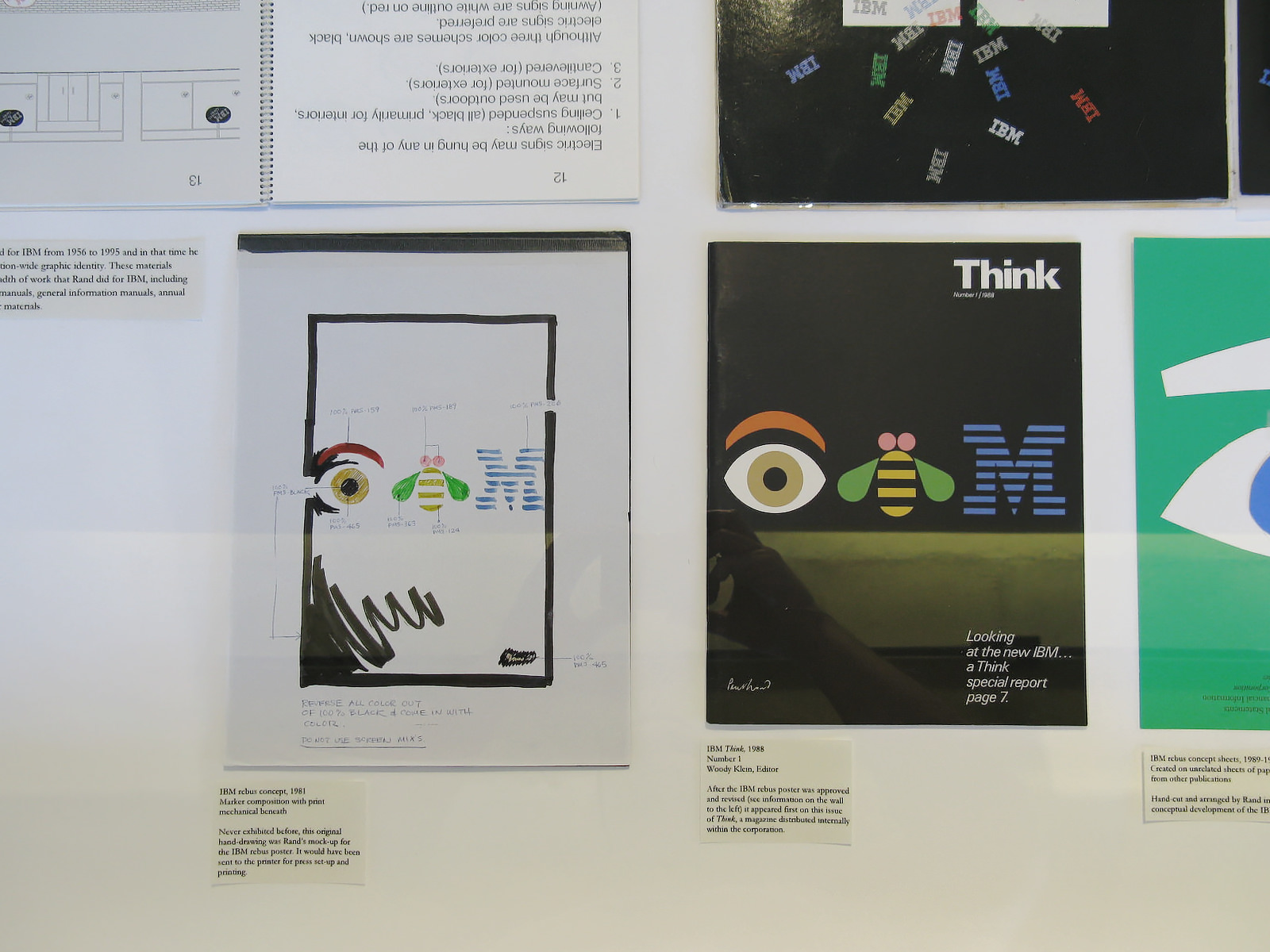
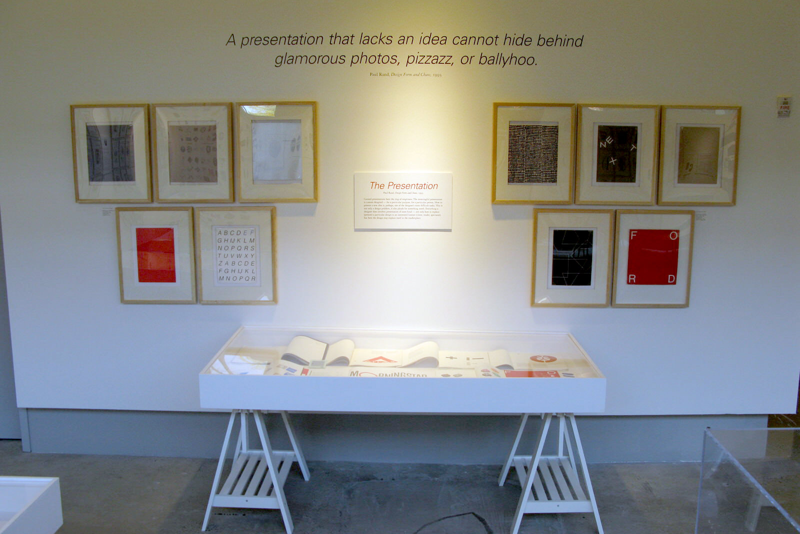
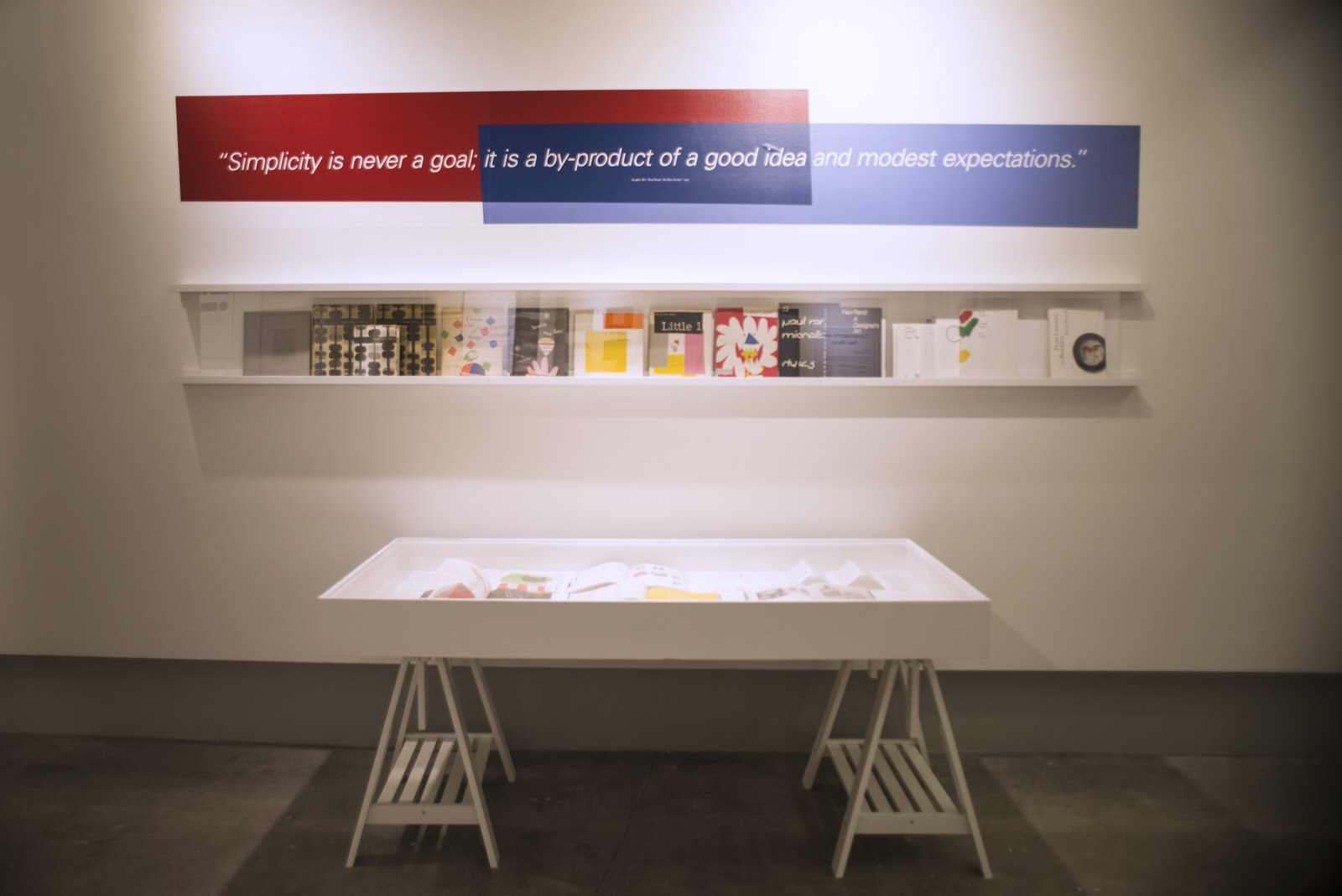
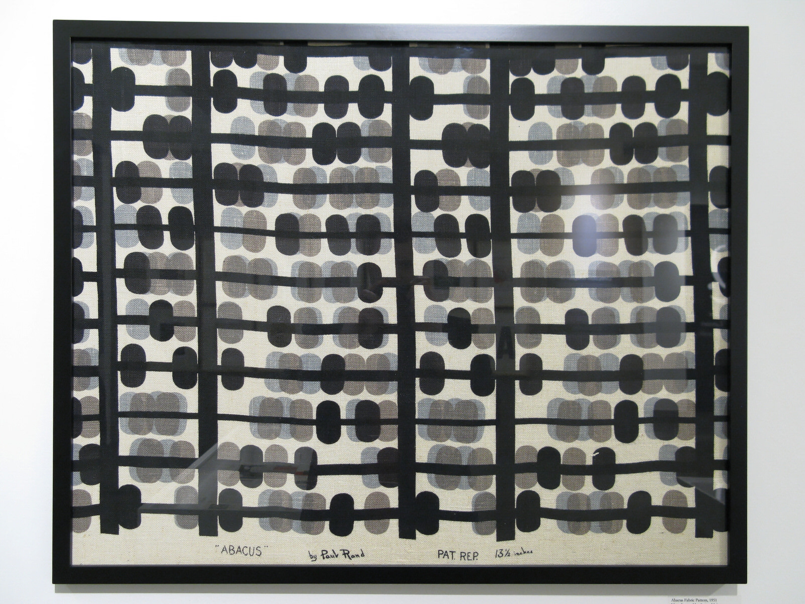
Using his own work and writings about the same aesthetic principles that defined the hallway examples as “art” we see work come to life in a different way. Special features in this gallery include original hand-cut color theory explorations of the famous Eye-Bee-M rebus and nearly all of his logo presentation booklets created for clients such as NeXT, Cummins, Ford and Morningstar.
Gallery B
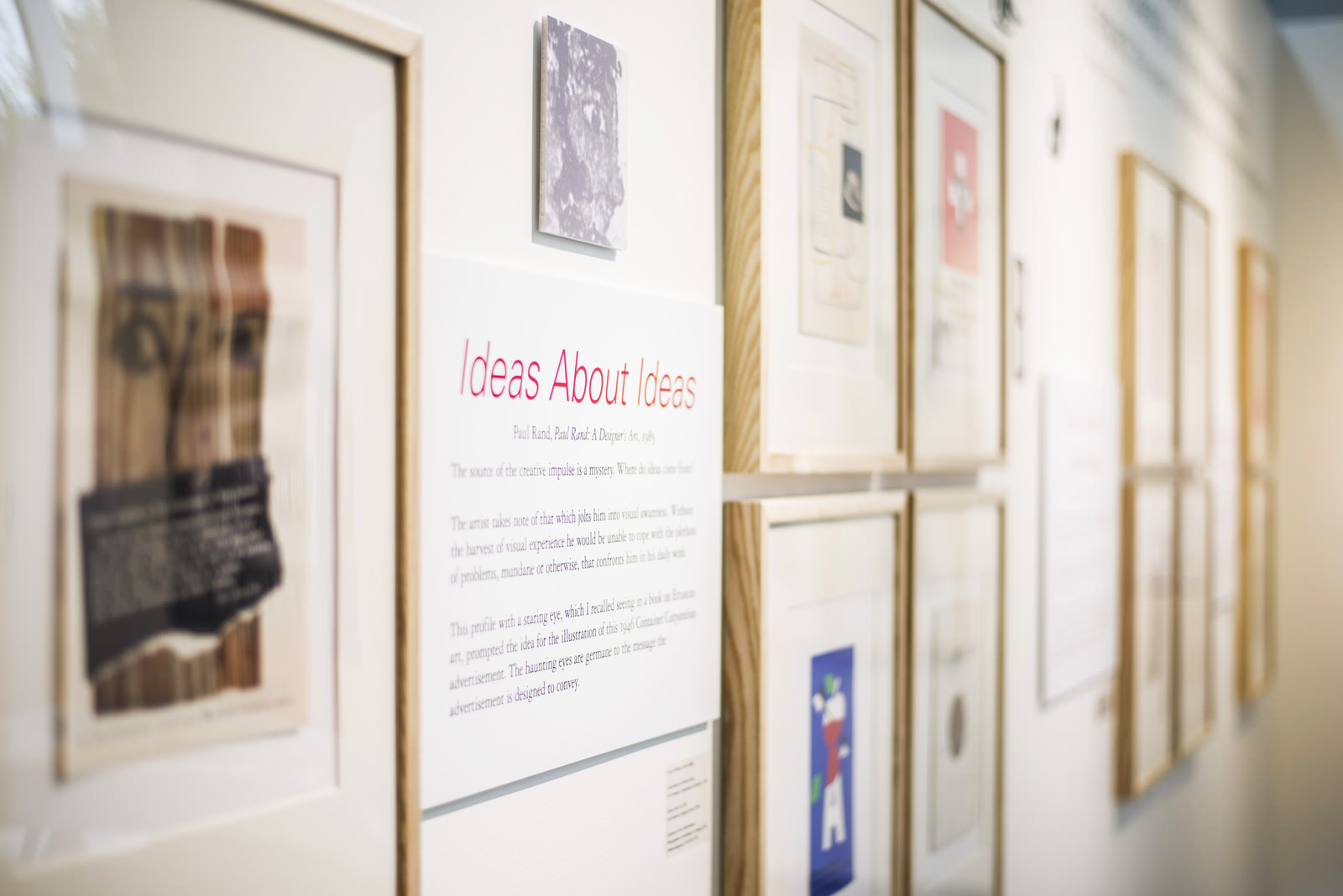
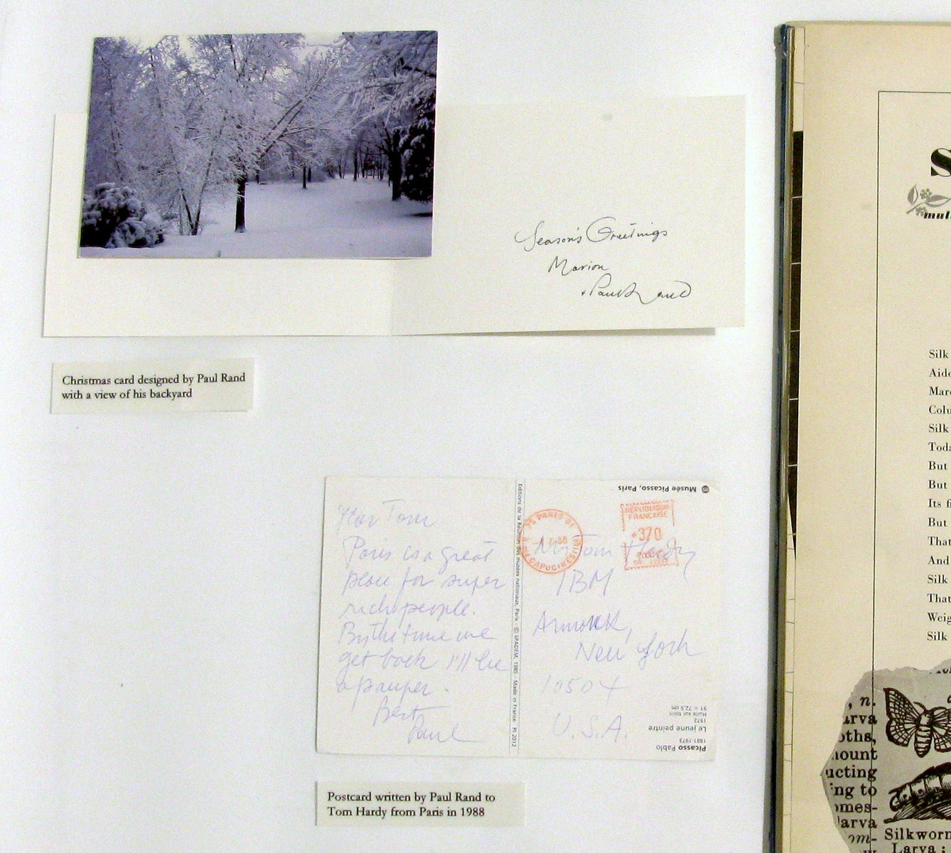
Gallery B contained a large selection of magazine articles written about Mr. Rand and personal items.
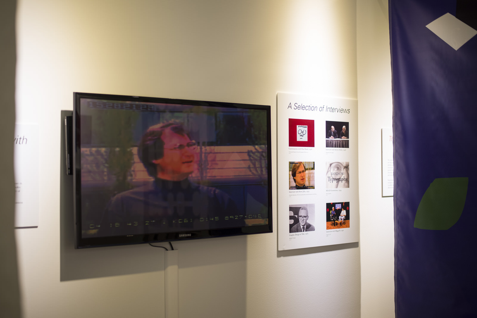
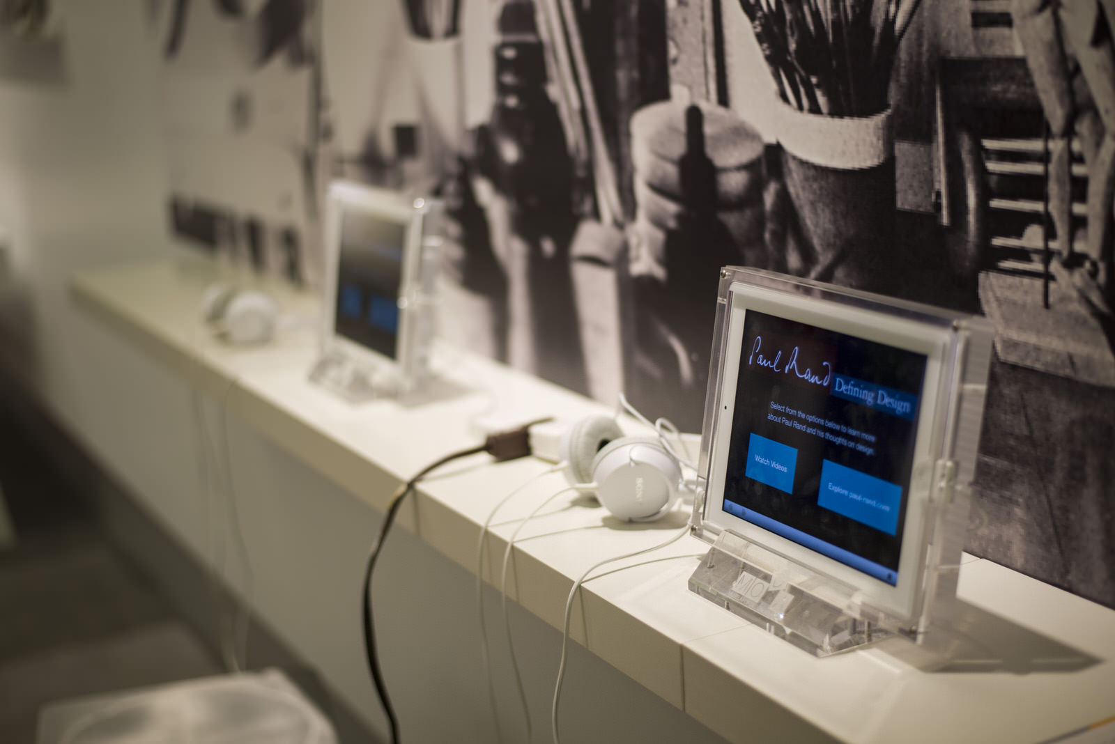
Visitors could watch Conversations with Paul Rand, a 30-minute documentary by Preston McClanahan. An iPad bar with even more videos and access to the Paul Rand website was available.
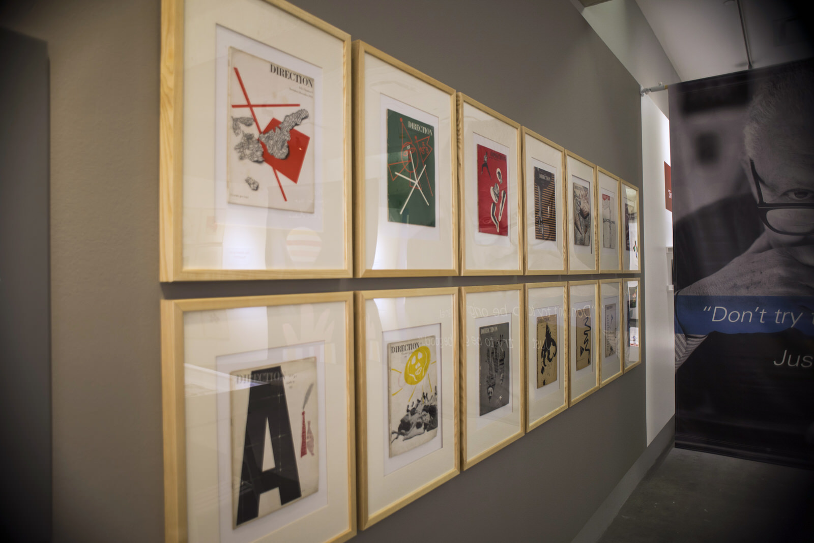
Other sections included information about his house, examples of collage & montage, repetition, and a large collection of his famous Direction magazines.
Steven Heller giving his evening lecture at the High Museum auditorium.

Steven Heller visited the exhibit on opening day. He gave lectures to students in the morning and to the design community in the evening prior to the opening party.
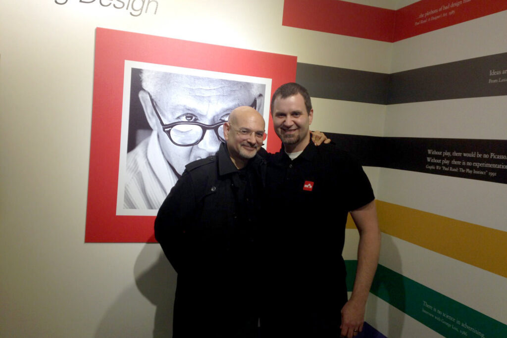
Danny and Steven at the opening night party.
He’s made a show that is both entertaining and didactic. He’s made a show, I think, even Paul Rand would like.
— Steven Heller
Press
The exhibit has received rave reviews from various sources and has been a huge success for MODA.
Here are a few highlighted articles and reviews…
Thank you
None of this could have happened without the contributions and help from everyone involved.
- Laura Flusche, Katie Simms, Clare Timmerman, Barbara Richardson, Carrie Whitney, the entire MODA staff
- Michael Skjei
- Tom Hardy
- Steven Heller
- Greg D’Onofrio and Patricia Belen
- Aaron Cohen
- Bob Burns
- Georgette Balance
- Hank Richardson
- Doug Grimmett
- Wade Beard and team at Express Color
